

Although February employment numbers released by Bureau of Labor Statistics (BLS) could be considered a disappointment, ADP’s numbers are more robust. Who’s right?
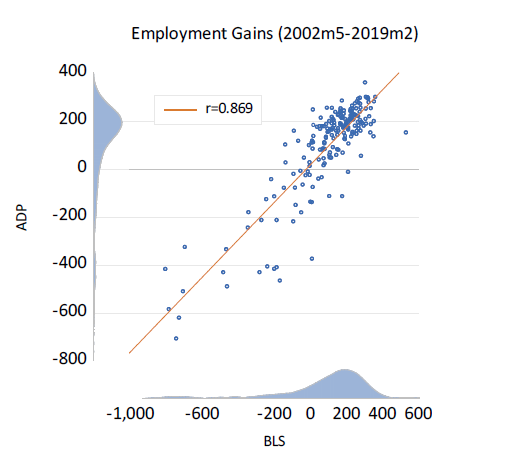
The February BLS employment report was a disappointment to many. According to BLS the U.S. economy only added 20,000 jobs in February, far below the expectations of economists. However, there is some good news: the U.S. economy added 183,000 in February, according to ADP’s National Employment Report. So, is the economy stalling out or just fine? How can two reports that estimate the exact same thing have results that are so different? If you compare both reports historically to one another they appear to do a pretty good job predicting employment or at least predicting each other.† The r=0.869 may appear impressive.
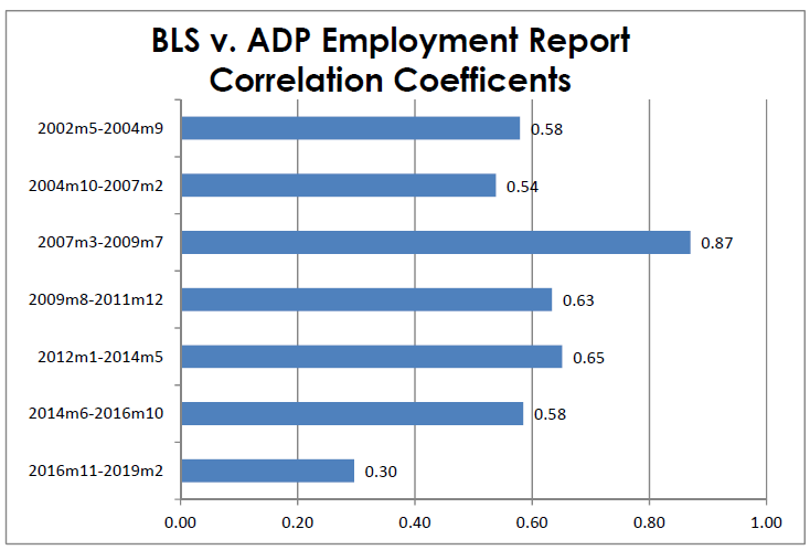
But breaking the correlations down and looking at more recent estimations show a different story. I broke the two samples of employment reports into seven equal samples containing 29 observations each (2016m11-2019m2 actually only has 28 observations). The results show a divergence between the ADP and BLS estimates that has begun to intensify lately. When you look into the individual subsections of the two reports, the differences become more glaring. The ADP report showed the construction sector adding 25,000 jobs while the BLS report showed the construction sector losing 31,000 jobs in February. That’s a difference of 56,000 jobs.
It is important to remember that government statistics are not true values. Instead, they are estimates. The way these estimates are calculated isn’t full proof either; the statistics are based on samples which are subject to errors, as BLS explains: “When a sample rather than the entire population is surveyed, there is a chance that the sample estimates may differ from the true population values they represent.” Because of sampling bias, BLS and ADP don’t actually know how many people have jobs or don’t have jobs at any given time, so what they use are confidence levels.
Put simply, there is a 90% chance, or level of confidence, that an estimate based on a sample will differ by no more than 1.6 standard errors from the “true” population value because of sampling error. At a 90% confidence level, which is what BLS uses, the monthly change in total employment is on the order of plus or minus 107,400 jobs. So when the BLS estimates +20,000 jobs in February, there is a 90% chance the true value will fall between -87,400 and +127,400.
I couldn’t find the standard errors and confidence level used by ADP, but it’s probably similar. Taking this in account, it’s easy to see why these two estimations can differ so much. Who is right? I don’t know! No one really knows, but the increasing divergence between the two reports shows that either BLS or ADP should probably redefine their methodologies. To have a better understanding of how many jobs have been added, it is probably best to average several months of estimates.
Many people often take the preliminary economic estimates as “gospel,” but it is important when looking at economic statistics not to take them at face value. For example, if the average person hears the unemployment is 4%, they likely come to the conclusion that 96% of the population is employed. That, however, is not the case; the unemployment rate is not a measure of those who have jobs minus those who don’t. Instead, BLS calculates unemployment by taking the number of unemployed people and dividing by the total labor force. Well, what defines who is in the “total labor force”? BLS defines it as a person either having a job or searching for a job in the past four weeks. This definition doesn’t account for other things like marginal, attached or discouraged workers or differentiate between part time and full time. In reality, the true unemployment rate, i.e. people without jobs is about 39%*. But politically, 4% has a much nicer ring than 39%, as the layman thinks 96% are employed.
So, what is the point of this article? It is merely a reminder to be wary when looking at economic statistics and not to take them at face value. No government statistic you ever see is the true value. Very often, the methodology in the creation of such statistics have a political implication. For instance, the Consumer Price Index, which many believe to the true rate inflation, is controversial in the world of economics. Some believe it overstates inflation, while others believe it understates it. Whatever the truth is, there is incentive to use a methodology that understates inflation because government uses tethers CPI increases to increases in social security and other social program payments.
Another metric worth mentioning is GDP. Most people think gross domestic product represents real economic growth, i.e. improved welfare and living standards. It is not, however: GDP is simply a national income account. In other words, GDP is a function of a nation’s aggregate production for the current year, calculated by the equation GDP= Consumption+Investment+Government Spending+Exports-Imports. Since government spending is a factor in the mathematical identity of GDP and GDP is a proxy for real economic growth, then government spending will be always be viewed as a contribution to growth even if the government spends money wastefully or engages in massive debt financing.
So, next time you’re watching the news and hear some pundit spouting economic figures, remember to view the figures with a grain of salt.
† r = correlation coefficient, 1=perfectly positively correlated, -1= perfectly negatively correlated, 0= no correlation
* total population (100.0%) – Percentage of Americans Employed February 2019 (60.7%)= Percentage of Americans not working (39.3%)